Fortran does not automatically allow for plotting during execution. There is a work around. I touched on this with my previous post about plotting with gnuplot from python. The same principles apply here.
From fortran call gnuplot. For instance, to make a vector plot from fortran use the command
call system('gnuplot Vector.gp')
where Vector.gp is the gnuplot setup file for vector plotting.
This also requires a datafile that gnuplot can read. I prefer a csv file because I can put that directly into other programs like excel as well.
So what I've done, is built an IO module with several subfunctions that will create a datafile for gnuplot and call the system for me. More plot types are on the way. See attached for details.
example scatter plot colored by the vorticity:
call cScatter(x,y,omegaz)
Fortran-GnuPlot Plotting.zip
By the way, I've switched to Atom text editor by github for my programming. The .gp files I included save as .png files so I can use them with both word and latex. Atom will open .png directly inside the editor and update as the figure updates. This is approaching an IDE and it's a lot faster to update the figure than with Windows Image Viewer. It should be a cross-platform solution too.
Showing posts with label Graphing. Show all posts
Showing posts with label Graphing. Show all posts
Thursday, September 3, 2015

Friday, January 13, 2012
Generating Publication Quality Figures in Matlab
Updated* See Step 7 - Post Processing
This is how I do it:
First we are assuming either the correct sizing for a figure that will fit on half a page so that 2 can be side by side on a 6.25 (or 6.5) inch text width OR that I have one elongated figure that fills the whole width - like a contour plot.
1) Specify the dimensions
% For Normal Figures
height=1.0/1.618; % width/golden ratio
width=1;
% For Wide Figures
% height=1.0/1.618; % width/golden ratio
% width=2;
scale=300; % 3.13 inches
I choose the golden ratio because it's considered aesthetically pleasing to the eye. It works well for large figures, but it might not be perfect for small figures. Just remember if you want to scale from a known dimension in inches use a converter to convert to pixels. 300 pixels is 3.13 inches
You can also position the figure on the screen
xpos=50;
ypos=500;
2) Define the function to be plotted. For the example, I generate one on the spot but this could be an import function
x=0:.01:2*pi;
f1=cos(x);
f2=sin(x);
3) Generate the figure. This doesn't just mean plot the data. The figure is comprised of the figure dimensions, the plot area, the bounding box, etc.. We also want to set the fonts and position
figure; % Create Figure
axes('FontName','Times New Roman') % Set axis font style
box('on'); % Define box around whole figure
set(gcf,'Position',[xpos ypos scale*width scale*height]) % Set figure format
4) Plot the data
hold on
plot1=plot(x,f1,'Color',[1 0 0]);
plot2=plot(x,f2,'Color',[0 0 1]);
by plotting each function as a different plot command and defining plot1 and plot2, we have unique control over the format of each data set.
5) Set Plot properties. This is different than setting figure properties and refers to the data set format
set(plot1,'LineWidth',1,'LineStyle','-');
set(plot2,'LineWidth',1,'LineStyle','--');
% Set Axis Limits
xlim([min(x), max(x)])
ylim([min(f1), max(f1)])
% Create xlabel
xlabel('\xi','FontSize',11,'FontName','Times New Roman','FontAngle','italic');
% Create ylabel
ylabel('\eta','FontSize',11,'FontName','Times New Roman','FontAngle','italic','rot',0);
% Create Legend
hleg1 = legend('$\cos(x)$','$\sin(x)$');
% Set Legend Properties
set(hleg1,'Interpreter','latex')
set(hleg1,'Location','SouthWest')
set(hleg1,'box','on')
There are more properties that can be set, but i just took the ones I use most.
6) Export figure
fig = gcf;
style = hgexport('factorystyle');
style.Bounds = 'loose';
hgexport(fig,'Example_Figure.eps',style,'applystyle', true);
drawnow;
print -depsc2 -tiff myfile.eps
There is something weird here: i don't think i have to use both the hgexport (like clicking File-Save As) and print but I don't get the right format without using both.
7) Post processing. This is really unfortunate. The problem is that Matlab doesn't embed fonts in eps files correctly (or at all). There are functions such as export_fig and exportfig that claim to do this, but I've not had any luck. Part of it is that I don't have time to mess with all the settings and syntax that comes with using other packages. Part of it is my frustration with the whole nonsense.
An option many people seem to use is Adobe Illustrator. The process goes: Open the eps and convert the text to outlines. I think this replaces the text with lines and fills so that the letters appear, but aren't actually text anymore. That's a good idea, but I spent some time poking around the trial and couldn't figure out how to set the damn page dimensions so the exported eps was back to its original size. It would always export it with a big white space around it. I think there's something about the clipping box but I don't have time to mess with this garbage. I'm a scientist, not a graphic designer.
Next option: ACD Canvas. Open the eps in canvas and convert to canvas object. Magically (expected), it imports the eps figure with the correct dimensions! Then select all and "convert to path." I'm not completely sure what goes on behind the scenes with this operation, but it appears to take whatever is selected and lump it all into some kind of vector graphic. Again, the text is no longer dependent on a font. The problem with this is that there is no more editing so make sure it's what you want before you convert it. This works fine and produces nice figures.
UPDATE - Canvas costs money beyond the trial version. Boo. Inkscape is the solution! It's a free, open source program that will do this stuff MUCH easier than Adobe and even easier as Canvas. Open the eps file. Make sure the fonts imported correctly. If not, fix them! Then save as eps. The dialog box will offer some really cool stuff for latex but we don't need that right now. Make sure the box "Convert texts to paths" is selected and the "export area is drawing" is selected (I don't know about the "export area is page" that sounds counter to the previous box but I left mine checked). I don't know what the rest does so leave it or not. It doesn't seem to matter. The important part is that the text is converted to paths!
Beyond that, Inkscape (and the others) let you edit figures. For instance, Matlab will automatically adjust the position of the axis and labels depending on the number of digits in the label. That means the axis won't necessarily line up correctly in the document. Inkscape can adjust the axis dimensions and the location of the labels and titles so that they all look correctly! Awesome!
This isn't perfect but it works pretty well. If you're without a better option, then this is definitely a viable possibility. Here is the whole matlab code:
%% Figure Generator with Format
% =========================================================================
clear;clc;close all
% =========================================================================
% Specify Dimensions and Position on Screen
% =========================================================================
% -------------------------------------------------------------------------
% Figure Dimensions
% -------------------------------------------------------------------------
% For Normal Figures
height=1.0/1.618; % width/golden ratio
width=1;
% For Wide Figures
% height=1.0/1.618; % width/golden ratio
% width=2;
scale=300; % 3.13 inches
% -------------------------------------------------------------------------
% Figure Position on Screen
% -------------------------------------------------------------------------
xpos=50;
ypos=500;
% =========================================================================
% Define Functions to be Plotted
% =========================================================================
x=0:.01:2*pi;
f1=cos(x);
f2=sin(x);
% =========================================================================
% Generate Figure
% =========================================================================
% -------------------------------------------------------------------------
% Figure Properties
% -------------------------------------------------------------------------
figure; % Create Figure
axes('FontName','Times New Roman') % Set axis font style
box('on'); % Define box around whole figure
set(gcf,'Position',[xpos ypos scale*width scale*height]) % Set figure format
% -------------------------------------------------------------------------
% Plot Data
% -------------------------------------------------------------------------
hold on
plot1=plot(x,f1,'Color',[1 0 0]);
plot2=plot(x,f2,'Color',[0 0 1]);
% -------------------------------------------------------------------------
% Plot Properties
% -------------------------------------------------------------------------
set(plot1,'LineWidth',1,'LineStyle','-');
set(plot2,'LineWidth',1,'LineStyle','--');
% Set Axis Limits
xlim([min(x), max(x)])
ylim([min(f1), max(f1)])
% Create xlabel
xlabel('\xi','FontSize',11,'FontName','Times New Roman','FontAngle','italic');
% xlabel('$\xi$','FontSize',11,'FontName','Times New Roman','interpreter','LaTex','rot',0);
% Create ylabel
ylabel('\eta','FontSize',11,'FontName','Times New Roman','FontAngle','italic','rot',0);
% ylabel('$\eta$','FontSize',11,'FontName','Times New Roman','interpreter','LaTex','rot',0);
% Create Legend
hleg1 = legend('$\cos(x)$','$\sin(x)$');
% Set Legend Properties
set(hleg1,'Interpreter','latex')
set(hleg1,'Location','SouthWest')
set(hleg1,'box','on')
% =========================================================================
% Export Figure
% =========================================================================
fig = gcf;
style = hgexport('factorystyle');
style.Bounds = 'loose';
hgexport(fig,'Example_Figure.eps',style,'applystyle', true);
drawnow;
print -depsc2 -tiff myfile.eps
Wednesday, December 1, 2010
Transparent Backgrounds in OriginLabs Plots
I was trying to overlay a layer with constant contour lines over a color fill contour plot with different contour lines to make a comparison between the two.
Adding the contour lines to the existing plot doesnt work because...and to remain consistent with the complete disregard for user friendliness...it "kinda" links the magnitude of the constant lines with the color map for the color fill plot. By "kinda" I mean it's a mess and is a terrible software that offers a lot of options and I can't get away from it AHHHHHH.
Solution: use colored markers...err...add another layer, but of course that doesn't work straight forwardly either. Even if all the layer management options for fill and background are "none" it isn't so you won't see the first layer plot. Solutions...light your computer on fire...err...open up format>layer>Size/Speed>Graphic Image Caching and select something else. "None" worked for me but this link suggests that there are other options.
Sunday, July 11, 2010
Strange Lines in eps File Print Outs
I can't imagine anyone else needing this post but maybe it'll save some poor soul hours of screwing around too.
I had plots generated in Origin that contained the function 1/r. I put them into the latex document and converted to pdf. Everything looked great in pdf form. When I printed it, vertical lines (slightly slanted) appeared that went from the top edge of the graph to the function. If I opened the eps in adobe and printed it, the lines shifted but were still present. If I printed from Origin they looked fine. If I printed to PDF from Origin, they were fine. If I printed to ps and converted to pdf they appeared again. I knew it wasn't a erroneous data point since they didn't show up anywhere else and shifted position depending on how I converted them.
Solution (sort of):
Use less data points. I was using 1000. The line disappeared when I used 500.
I have NO idea where or what the problem was but there you go.
I had plots generated in Origin that contained the function 1/r. I put them into the latex document and converted to pdf. Everything looked great in pdf form. When I printed it, vertical lines (slightly slanted) appeared that went from the top edge of the graph to the function. If I opened the eps in adobe and printed it, the lines shifted but were still present. If I printed from Origin they looked fine. If I printed to PDF from Origin, they were fine. If I printed to ps and converted to pdf they appeared again. I knew it wasn't a erroneous data point since they didn't show up anywhere else and shifted position depending on how I converted them.
Solution (sort of):
Use less data points. I was using 1000. The line disappeared when I used 500.
I have NO idea where or what the problem was but there you go.
UPDATE* This problem persists and is total BS!!! The solution above didn't work for another example. What i noticed was it only occurs if there is a lot of data points outside of the plot range. I thought, well maybe for some reason the points outside of the plot area are connecting with the points inside. I though this because only the data range containing points outside the graph had a problem.
Solution! Don't include the full plot range. If you don't include the largest datapoint the stray line changes position, if you dont include the largest 2, it changes again. At some point it will disappear. I don't know how many you need to eliminate but one to a few. The easiest way to do this is to go to the graph, right click, plot setup, click on the offending graph data, click the button that appears next to the range (has 3 dots on it) and change the starting row to not include the first few data points. This way, if you want to rescale the axis to include more data it still remains. The other option is deleting it manually. This is much quicker but not advised.
Wednesday, June 9, 2010
Aligning Axis Labels in OriginPro
If you have multiple figures and you want all the axis labels to be in the same spot, copy the label from a finalized figure and paste it anywhere into the new one. Then hit ctrl+z and it will snap to the same location on the new graph.
OriginPro: How to label axis ticks in terms of pi
If you're plotting numeric values from 0-2pi for instance and we want the x-axis labels to be in terms of pi (0, pi/2, pi, 3pi/2, 2pi) then open up the book containing your dataset and add a column.
Then enter the values of 0, p/2, p, 3p/2, 2p in the rows of the new column.
Then go to the plot and double click on the x-axis then the Tick Labels tab.
Change the font to Symbol and the "type" to Tick-indexed datas.
In the Dataset box select the column containing the axis labels and click apply.
Then enter the values of 0, p/2, p, 3p/2, 2p in the rows of the new column.
Then go to the plot and double click on the x-axis then the Tick Labels tab.
Change the font to Symbol and the "type" to Tick-indexed datas.
In the Dataset box select the column containing the axis labels and click apply.
Monday, January 4, 2010
Origin Plot Settings for HQ Graphs
If you've hit this blog before you may realize I think Origin is a TERRIBLE piece of software to use. I have resolved to become proficient with it since there is a license available to me and my boss uses it exclusively. All I have to say is thank god I'm using LaTeX for most of my pubs because as far as I can tell Origin still gives you the middle finger if you want predictable results in MS Word. Anyway...here are the settings and steps that seem to work best for me
Open Origin and click on Tools>Options


Once you have a graph started under Format>Page


*UPDATE* one more thing...it seems that if you make graphs on different computers one more setting should be changed to ensure they are standardized. I think the disparity might be with the printer settings on different computers. The layer location on the graph needs to be manually set. Use
 This seems to center the figure vertically well.
This is for a B&W publication that will fit 2 graphs horizontally for standard margins. Leave the rest alone
Then since I use LaTeX, you must export them into .eps so
File>Export
 be sure Margin Control is on Page. That's important for all the axis to line up.
*UPDATE* Because Origin's terrible programming, it is important to export ONE GRAPH AT A TIME! Doing multiple exports at once can shift the position of labels and axis of the output file so that subfigures won't align properly. That was an hour of my life I'll never get back...thanks Origin. Good one :(
*UPDATE x2* Ok, amending some of the settings above to maximize the figure area. Set the page to 3.13 x 2 and then the layer dimensions look like
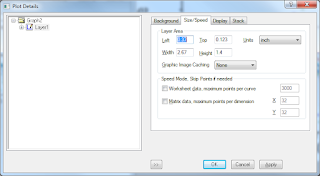
then make the axis major ticks to be 3pts. This will make the axis labels fill the entire page when the scales are as small as -9999 (4 characters from the edge of the axis to the edge of the page) for both x and y.
Then in LaTeX the command will look something like
% PRESSURE FIGURES
%===============================================================================================
\begin{figure}
% Requires \usepackage{graphicx}
\centering % centers everything on the page
\subfigure[]
{
\includegraphics[width=3.13in, height=1.75in]{Final_Figures/Pressure_dpdr}% include figure
\label{Fig. SubSec: Pressure_dpdr}
}
\subfigure[]
{
\includegraphics[width=3.13in, height=1.75in]{Final_Figures/Pressure_P}% include figure
\label{Fig. SubSec: Pressure_P}
}
\caption{Variation with vortex Reynolds number of \ref{Fig. SubSec: Pressure_dpdr} the radial derivative of pressure and \ref{Fig. SubSec: Pressure_P}. $\kappa=0.103$ for all plots.} % text to be included under all figures
\label{Fig. SubSec: Pressure}
\end{figure}
%===============================================================================================
Friday, April 24, 2009
Figures, Subfigures, and Table Syntax in Latex
UPDATED* Now I use the package \usepackage{float} for figures and tables. It allows easy manual editing of how the figures are labeled and works for both tables and figures.The code looks like
\usepackage{float} % figure floats\usepackage{subfig} % package for subfigure formatting \renewcommand{\thesubfigure}{\alph{subfigure}}% removed \textbf lest Fig. 1a is bolded in the text \renewcommand{\thesubtable}{\arabic{subtable}}% removed \textbf lest Table 1 is bolded in the text %===============================================================================================
% GRID REFINEMENT %=============================================================================================== \begin{figure} % Requires \usepackage{graphicx} \centering % centers everything on the page \subfloat[\textbf{a)} Axisymmetric perturbations ($q=0$)] { \includegraphics[width=3.13in, height=1.75in]{figures/Ch_LNP_of_BV/LNP_Axisymmetric_Grid_Refinement}% include figure \label{Ch:LNP of BV Fig:Axisymmetric Grid Refinement}} \subfloat[\textbf{b)} Asymmetric perturbations ($q=1$)] { \includegraphics[width=3.13in, height=1.75in]{figures/Ch_LNP_of_BV/LNP_Asymmetric_Grid_Refinement}% include figure \label{Ch:LNP of BV Fig:Asymetric Grid Refinement}} \caption{Grid refinement for $\alpha=3$, $z=1.5$, $Re=10,000$, and $\kappa=0.1$} % text to be included under all figures \label{Ch:LNP of BV Fig:Grid Refinement} \end{figure} %=============================================================================================== OLD WAY USING SUBFIGURE
\documentclass{article}
%   PREAMBLE
%=================================================================================================
\usepackage{amsmath}    % math format package
\usepackage{booktabs}   % professional tables package
\usepackage[final]{graphicx}   % figures package
\usepackage{subfigure}  % package for subfigure formatting
%=================================================================================================

% you must include \usepackage{graphicx}.  this has 2 options - [final] for final drafts - [draft]
only gives a place holder and doesn't render the image.

% for pdf documents the image must be in pdf form. for dvi the image must be in eps.

% to use figures in a separate subdirectory use "folder_name/file_name"

% it's not perfect because it is touchy about the files it can use.  you could use a dummy eps
file so the dvi compiler will work. or you do the figures only in pdf and don't include them until
done.

% \includegraphics[width=?]{} gives options to change the properties such as width, leaving it
blank uses the original sizes

% some of the journal styles cause problems with this for some reason
%=========================
% THIS IS A SINGLE FIGURE
%=========================
\begin{figure}
% Requires \usepackage{graphicx}
\centering % centers everything on the page
\includegraphics{Final_Figures/S=50}\\ % include figure
\caption{$\lambda=50$} % text to be included with figure
\label{fig:lambda=50}
\end{figure}

%=================================
% THIS IS A FIGURE WITH SUBFIGURES
%=================================

\begin{figure}
% Requires \usepackage{graphicx}
\centering % centers everything on the page
\subfigure[] % text to be included with figure 1 goes inside '[]'
{
 \includegraphics[width=2.5in, height=1.75in]{Final_Figures/S=50}% include figure
 \label{fig:1lambda=50}
}
\subfigure[] % text to be included with figure 2 goes inside '[]'
{
 \includegraphics[width=2.25in, height=1.75in]{Final_Figures/S=100}% include figure
 \label{fig:1lambda=100}
}
\subfigure[] % text to be included with figure 3 goes inside '[]'
{
 \includegraphics[width=2.5in, height=1.75in]{Final_Figures/S=200}% include figure
 \label{fig:1lambda=200}
}
\subfigure[] % text to be included with figure 4 goes inside '[]'
{
 \includegraphics[width=2.25in, height=1.75in]{Final_Figures/S=400}% include figure
 \label{fig:1lambda=400}
}
\caption{Analytical and numerical solutions of the eigenfunction equation with
$a_0 = -\cos \left(\frac{1}{2}\pi y\right)$, $\xi=5$, $n=1$, $\omega_n t=\pi/2$, $x/l=0.5$
and a Strouhal number of (a) $\lambda=50$  (b) 100   (c) 200   and (d)
400. The agreement between numerics and asymptotics continues to improve with
successive increases in the Strouhal number despite the highly oscillatory nature of
the solution and the radical reduction in spatial wavelength.} % text to be included
under all figures
\label{fig:Solution with several Lambdas}
\end{figure}

% =====================
% THIS IS FOR TABLES
% =====================
% be sure to use \usepackage{booktabs} in the preamble

% tables and tabular are different things.  Tabular gives you the format of a table,
but the
\table command is required to actually identify it as a table in the document with automatic
cross-referencing and whatnot.

% the tabular command has the format \begin{tabular}{ x y z }.  {x y z} are replaced
by the cell formatting 'l' for left 'c' for center 'r' for right.  it can appear as
{|x|y|z|} to give vertical lines

% to span multiple cells use
\multicolumn{number of cells to span}{cell formatting}{What appears in the cell goes here}\\

% the '\\' command moves to the next line

     \begin{table} % begin the table identification command
 \addtolength{\tabcolsep}{-4pt}
     \centering % ensure it centers on the page.  modify this if centering is not wanted
     \caption{Comparison between numerical and asymptotic solutions for both Type I and Type II.
Here $\lambda=10$, $\varepsilon=10^{-3}$, $n=0$, $a_0=-\cos(\frac{1}{2}\pi x)$, and $b_0=(2n+2)F'$}
% this is the text appearing with the table - description
     \label{table:Comparing the Types} % this is the label for cross-referencing

         \begin{tabular}{c|c c c|ccc|c} % this begins the table format
             \toprule % bold horizontal line command
& \multicolumn{3}{c|}{Type I}& \multicolumn{3}{c|}{Type II}& Numerical\\
\cmidrule(){2-8}
$x$ &   $f^{(2)}$ & $f^{(3)}$ & $f^{(4)}$ &
$f^{(2)}$ & $f^{(3)}$ & $f^{(4)}$ & $f^N$\\
             \midrule % horizontal line command

      0 &          1 &          1 &          1 &          1 &          1 &          1 &          1 \\

   0.05 &  0.8676644 &  0.8674551 &   0.867459 &  0.8676685 &   0.867459 &   0.867459 &   0.867459 \\

    0.1 &  0.5188763 &  0.5186301 &  0.5186429 &  0.5188833 &  0.5186428 &  0.5186429 &  0.5186429 \\

    0.2 & -0.3939219 & -0.3935576 & -0.3935347 & -0.3939428 &  -0.393534 & -0.3935347 & -0.3935347 \\

    0.3 & -0.7672007 & -0.7662141 &  -0.766217 & -0.7672949 & -0.7662147 &  -0.766217 & -0.7662171 \\

    0.4 & -0.2589166 & -0.2585327 & -0.2585659 & -0.2589812 & -0.2585645 & -0.2585659 & -0.2585659 \\

    0.5 &  0.3586916 &  0.3582113 &  0.3582018 &  0.3589124 &  0.3581976 &  0.3582018 &  0.3582018 \\

    0.6 &  0.2062112 &  0.2061807 &  0.2061778 &   0.206496 &  0.2061744 &  0.2061778 &  0.2061778 \\

    0.7 & -0.1574955 &  -0.158249 & -0.1582805 &  -0.158256 & -0.1582757 & -0.1582805 & -0.1582805 \\

    0.8 &  0.0345428 &  0.0357267 &  0.0360158 &  0.0356684 &  0.0360156 &  0.0360158 &  0.0360158 \\

    0.9 & -0.0049035 & -0.0104253 & -0.0091613 &  -0.008804 & -0.0091688 & -0.0091612 & -0.0091613 \\

   0.95 & -0.0000306 &   34513650 &  0.0008021 &  0.0006995 &  0.0008034 &  0.0008017 &  0.0008015 \\

   1.0  &          0 &  $\infty$  &          0 & -0.0000111 & -0.0000168 &  -0.000017 & -0.0000339 \\

             \bottomrule % horizontal line command
         \end{tabular}

 \end{table}

\end{document}
Be sure to put the \label{} command below the \caption{} command for figures and tables. See this post for more on this point.
I used this link to learn about subfigures and this and this for tables. Also, i found a great editor that exports excel data to latex format here.
This is where i figured out how to put verbatim code in Blogger
Friday, March 20, 2009
Properly labeling Tables and Figures in Latex
As with all things in Latex; it can be done, but it might not make sense.
If you have tables and figures throughout your document you might come across the problem that your \ref{} command considers tables and figures the same thing and therefore gives the wrong number. For instance if your document has tables and figures appearing in the following order
Table 1
Table 2
Figure 1
and you try to reference Figure 1 you might actually get a "3" instead of "1." This happens if you label your figures and tables wrong. To avoid this always make sure the \label{} is AFTER the \caption{} for both tables and figures. That should make everything work fine.
Remember
\caption{}
\label{}
If you have tables and figures throughout your document you might come across the problem that your \ref{} command considers tables and figures the same thing and therefore gives the wrong number. For instance if your document has tables and figures appearing in the following order
Table 1
Table 2
Figure 1
and you try to reference Figure 1 you might actually get a "3" instead of "1." This happens if you label your figures and tables wrong. To avoid this always make sure the \label{} is AFTER the \caption{} for both tables and figures. That should make everything work fine.
Remember
\caption{}
\label{}
Wednesday, March 11, 2009
Error Plots in Graphpad
Graphpad is designed for statistical analysis. It has some really complicated analysis tools for those apps. However it is NOT easy to wade through all that mess to do something simple like take one column and subtract it from the other.
To do simple stuff like that click
>Analyze
then select the data sets to be included then click
>Remove baseline and column math (Transform, Normalize list)
>Selected column(s)
Click the column you want as the base (for instance the column containing the exact solution)
>Calculation (pick your operation)
>Create new graph of the result
that's it. I'm not sure how it handles negative numbers exactly. you might have to create another column or do it by hand.
To do simple stuff like that click
>Analyze
then select the data sets to be included then click
>Remove baseline and column math (Transform, Normalize list)
>Selected column(s)
Click the column you want as the base (for instance the column containing the exact solution)
>Calculation (pick your operation)
>Create new graph of the result
that's it. I'm not sure how it handles negative numbers exactly. you might have to create another column or do it by hand.
Alignment for Labels in Graphpad
I don't use the built in axis or title labels. Instead I use Mathtype. Most of my labels require numbers and symbols anyway so i stay consistent by using it throughout.
The picture below shows where i like to position the Mathtype labels. The black squares always align to an edge.
The picture below shows where i like to position the Mathtype labels. The black squares always align to an edge.

Sizing Graphpad Plots
In order to generate plots that are always the same regardless if they appear in print alone or with other plots in the same figure you should build a layout.
My first post on Graphpad has my Preferences so the numbers here are based on those settings, but it might not matter.
First select the type of plot, import the data, and let it autogenerate the plot. Then go in and fine tune the details (labels, line type, legend position...). Start a new data table and import the next set...so on and so forth.
First thing to know is that for multiple graph layouts each graph appears as 86% of the original size. Therefore for single graph layouts (yes create a layout for a single graph too because the sizing options are different) need to be resized to 86%. If you don't use my preferences make a horizontally spaced layout and put two graphs in it. Then double click on one to see the size in percent. By default it autoadjusts and tells the percentage. Different journals have different margins so you'll be figuring it out on your own more often than not.
This seems to work regardless of how you make and position axis labels, titles, legends. If they don't line up, there is an "align axis" option and it'll work fine. Also, don't forget the option Right Click equalize graph size.
IF you're using Word for the final document...there is a button to send directly to Word or Powerpoint. This works great(ish). For layouts with several figures, this couldn't be easier. 1 button click. For single graphs, Word enlarges them slightly so you have to fumble with the sizes to make all your plots consistent.
For LaTeX users, I would still bother with multigraph layouts. The subfigure package for LaTeX will do it for you, but if you don't get the graphs exactly the same size, it'll be finicky. The graphpad layouts are easier.
Either LaTeX or Word users, i'd suggest exporting the layouts to something else rather than using the auto send button for Word. Clearly, LaTeX users have to do this. Graphpad makes this easy by giving the option to just export only the graph and not the whole white page for pdf and eps. There are other options for other image types. I export to pdf and include \usepackage{subfigure} for LaTeX. For Word I build Layouts and export as either EMF or TIF. Resolutions can be changed if need be.
UPDATE:
If you want to use the subfigure package in LaTeX, then I recommend exporting each figure individually and using the following settings:
Double click on the graph (not the layout graph)
Size: Wide
Frame: 3.13in wide X 2.09in high
click export, select format, and set
Size: Make width 4.24
That gets the whole figure neatly framed
in LaTeX
\includegraphics[width=3.13in, height=2.09in]{"figure file"}
That gives a nice side by side
My first post on Graphpad has my Preferences so the numbers here are based on those settings, but it might not matter.
First select the type of plot, import the data, and let it autogenerate the plot. Then go in and fine tune the details (labels, line type, legend position...). Start a new data table and import the next set...so on and so forth.
First thing to know is that for multiple graph layouts each graph appears as 86% of the original size. Therefore for single graph layouts (yes create a layout for a single graph too because the sizing options are different) need to be resized to 86%. If you don't use my preferences make a horizontally spaced layout and put two graphs in it. Then double click on one to see the size in percent. By default it autoadjusts and tells the percentage. Different journals have different margins so you'll be figuring it out on your own more often than not.
This seems to work regardless of how you make and position axis labels, titles, legends. If they don't line up, there is an "align axis" option and it'll work fine. Also, don't forget the option Right Click equalize graph size.
IF you're using Word for the final document...there is a button to send directly to Word or Powerpoint. This works great(ish). For layouts with several figures, this couldn't be easier. 1 button click. For single graphs, Word enlarges them slightly so you have to fumble with the sizes to make all your plots consistent.
For LaTeX users, I would still bother with multigraph layouts. The subfigure package for LaTeX will do it for you, but if you don't get the graphs exactly the same size, it'll be finicky. The graphpad layouts are easier.
Either LaTeX or Word users, i'd suggest exporting the layouts to something else rather than using the auto send button for Word. Clearly, LaTeX users have to do this. Graphpad makes this easy by giving the option to just export only the graph and not the whole white page for pdf and eps. There are other options for other image types. I export to pdf and include \usepackage{subfigure} for LaTeX. For Word I build Layouts and export as either EMF or TIF. Resolutions can be changed if need be.
UPDATE:
If you want to use the subfigure package in LaTeX, then I recommend exporting each figure individually and using the following settings:
Double click on the graph (not the layout graph)
Size: Wide
Frame: 3.13in wide X 2.09in high
click export, select format, and set
Size: Make width 4.24
That gets the whole figure neatly framed
in LaTeX
\includegraphics[width=3.13in, height=2.09in]{"figure file"}
That gives a nice side by side
Graphpad vs. Origin for Scientific Plotting
I had been using Origin to generate plots mostly because that's what my adviser used. I absolutely despise Origin. I complain that I expect things to "just work." Origin caused me so many headaches during my Master's thesis that I was desperate to find another option.
I found Graphpad. I've been messing around with the trial (nothing good is ever free) and have decided it is superior for a few simple reasons. First it integrates Mathtype so i can guarantee the size of my fonts are always consistent. In Origin you had to copy in Mathtype as images and resize inside Origin, but the point size differed if it had subscripts or superscripts. There is an "align" option in Graphpad that guarentees alignment of axis in the final result. This is also useful for inset plots or denoting graph a, b, c,...etc. and making sure that everything lines up correctly.
Also origin would leave large white areas around the outside of the plot unless you changed the preferences. Importing a plot made with someone elses settings would almost always screw things up. Importing to Word was also a nightmare with crashes, but mostly with alignment problems. Graphpad has a layout feature that builds the final plot for you. For instance if I want two plots side by side, I just go to that layout and drag and drop the previously (automatically) generated plots into the placeholders.
If you have multiple plots that you want to ensure are identical in format, there's a magic want tool for that. It's not more than 3 clicks. If you are importing data from multiple files or only certain columns or rows, the filter tab has everything you need. You can view EVERYTHING before it is generated - the data before it's imported or the graphs before they are formatted.
Origin is more powerful. Graphpad appears to be made for business rather than science. It can't do 3D plots or some of the other fancy things Origin can do, but for simplicity, predictability, intuitive design, and repeatability Graphpad is superior by far. Consider that I went from downloading the trial to figuring out how to set up preferences to importing data to generating professional high quality graphs in about an hour with Graphpad. I've been using Origin for over 4 years and still haven't figured out ways around the problems I've faced.
These are the Preferences i use for scientific plots
AXES
height -1.75
shape -wide
frame -no frame
thickness -1pt
ticks -outside
Default color scheme black and white
FONTS
main -regular times 14
axis titles -regular times 12
numbering -regular times 12
legend -regular times 12
SYMBOLS AND LINES
line thickness -1/2pt
FRAME
3.13w
1.75h
I found Graphpad. I've been messing around with the trial (nothing good is ever free) and have decided it is superior for a few simple reasons. First it integrates Mathtype so i can guarantee the size of my fonts are always consistent. In Origin you had to copy in Mathtype as images and resize inside Origin, but the point size differed if it had subscripts or superscripts. There is an "align" option in Graphpad that guarentees alignment of axis in the final result. This is also useful for inset plots or denoting graph a, b, c,...etc. and making sure that everything lines up correctly.
Also origin would leave large white areas around the outside of the plot unless you changed the preferences. Importing a plot made with someone elses settings would almost always screw things up. Importing to Word was also a nightmare with crashes, but mostly with alignment problems. Graphpad has a layout feature that builds the final plot for you. For instance if I want two plots side by side, I just go to that layout and drag and drop the previously (automatically) generated plots into the placeholders.
If you have multiple plots that you want to ensure are identical in format, there's a magic want tool for that. It's not more than 3 clicks. If you are importing data from multiple files or only certain columns or rows, the filter tab has everything you need. You can view EVERYTHING before it is generated - the data before it's imported or the graphs before they are formatted.
Origin is more powerful. Graphpad appears to be made for business rather than science. It can't do 3D plots or some of the other fancy things Origin can do, but for simplicity, predictability, intuitive design, and repeatability Graphpad is superior by far. Consider that I went from downloading the trial to figuring out how to set up preferences to importing data to generating professional high quality graphs in about an hour with Graphpad. I've been using Origin for over 4 years and still haven't figured out ways around the problems I've faced.
These are the Preferences i use for scientific plots
AXES
height -1.75
shape -wide
frame -no frame
thickness -1pt
ticks -outside
Default color scheme black and white
FONTS
main -regular times 14
axis titles -regular times 12
numbering -regular times 12
legend -regular times 12
SYMBOLS AND LINES
line thickness -1/2pt
FRAME
3.13w
1.75h
Subscribe to:
Posts (Atom)
